← Back
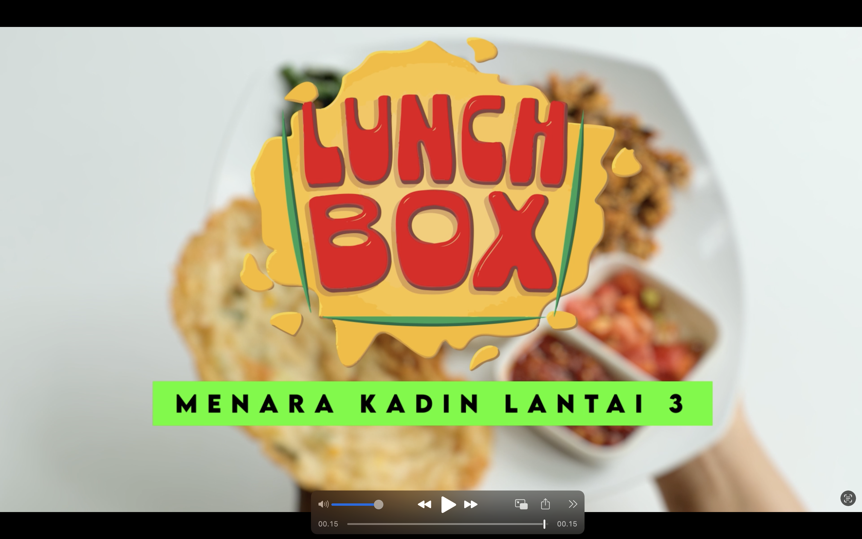
LUNCHBOX TVC
A TV commercial and motion design campaign created for Lunch Box, combining food cinematography, dynamic typography, and promotional storytelling to strengthen brand visibility and communicate a fresh, energetic dining experience.
Overview
This project focused on producing a short-form promotional video for Lunch Box that blended motion graphics, video editing, and commercial storytelling into a compact but memorable visual experience. The objective was not only to showcase menu offerings, but also to establish a recognizable visual identity that felt playful, modern, and appetite-inducing. The final output was designed to work across digital displays, social platforms, and in-store promotional channels.
Challenge
The biggest challenge was transforming simple food footage into an engaging commercial experience within a limited duration. The visual direction needed to communicate taste, variety, and accessibility while maintaining high pacing and strong brand recall. Because food content can easily feel repetitive, the project required a careful balance between cinematic presentation, typography motion, transitions, and rhythm to keep attention throughout the entire sequence.
Approach
The production process started with identifying a visual language that reflected Lunch Box’s identity—bold, colorful, and energetic. Food shots were edited to emphasize texture, freshness, and presentation while motion graphics were layered to create emphasis on key messaging and branding moments. Large-format typography, animated title cards, promotional overlays, and rhythmic transitions were used to create visual momentum and guide attention across scenes. The editing style prioritized quick readability and visual impact while maintaining a clean commercial aesthetic.
The motion design system was built to support modular adaptation, allowing assets to be reused across multiple promotional formats and future campaign extensions. Typography treatment, color blocking, and animated compositions were intentionally designed to strengthen recognition and improve retention
The motion design system was built to support modular adaptation, allowing assets to be reused across multiple promotional formats and future campaign extensions. Typography treatment, color blocking, and animated compositions were intentionally designed to strengthen recognition and improve retention
Outcome
The final TVC delivered a vibrant and memorable brand presentation that elevated Lunch Box beyond standard food advertising. Through the integration of motion graphics, commercial editing, and visual storytelling, the project successfully translated menu presentation into an energetic viewing experience designed to increase awareness, strengthen identity, and support future marketing campaigns.
Tools & Skills
After Effect
Premiere Pro
Adobe Illustrator